
Restaurant & Bar
Blending aesthetics and flavor in perfect harmony.


ABOUT
Industry: Food and Beverage
Solutions: New Branding, Print Design, Packaging Design, and Photo Styling
Style: Delightful, Whimsical, and Vintage Charm
DESIGN CONCEPT
The "Cheugy" brand's design concept blends nostalgia with modernity, fusing retro and contemporary elements. Its color palette features soft pastels—yellows, pinks, blues, and earthy reds—lending a warm, vintage charm to the designs. The typography is a playful mix of hand-drawn and elegant serif fonts, balancing fun with sophistication. Whimsical illustrations depict casual scenes, wine bottles, and packaging, creating a relaxed, carefree vibe. This approachable yet stylish brand identity appeals to a broad audience, making it ideal for a modern lifestyle brand.

-
![]() Description goes here
Description goes here -
![]() Description goes here
Description goes here -
![]() Description goes here
Description goes here


ABOUT
Industry: Food & Restaurant
Solutions: New Brand Identity, Logo, Color Palette, Font Pairing and Brand Tagline
Style: Warm, Minimal, Modern and Contemporary Elegance
DESIGN CONCEPT
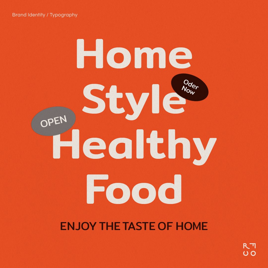
Replenishing our energy with rice and finding happiness in sharing a meal.
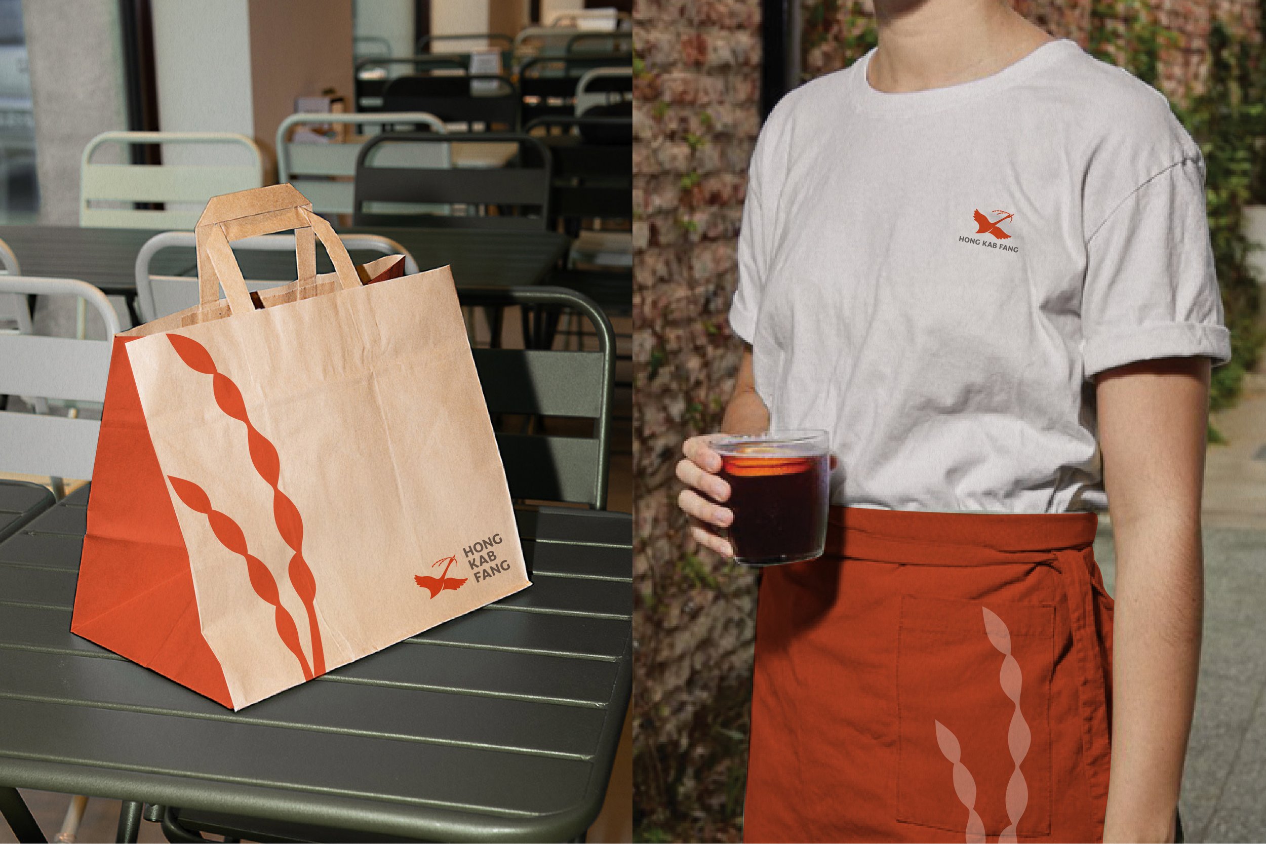
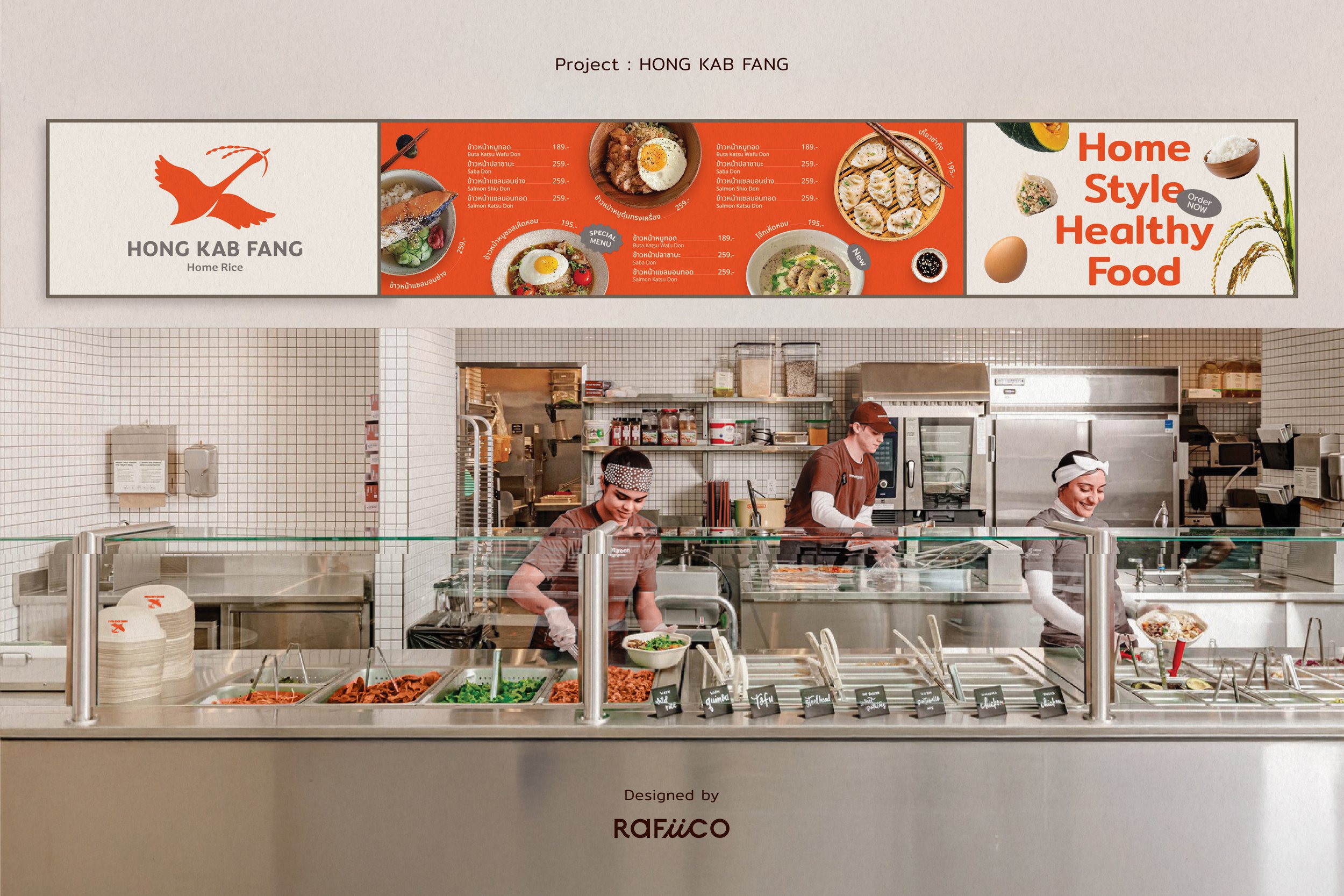
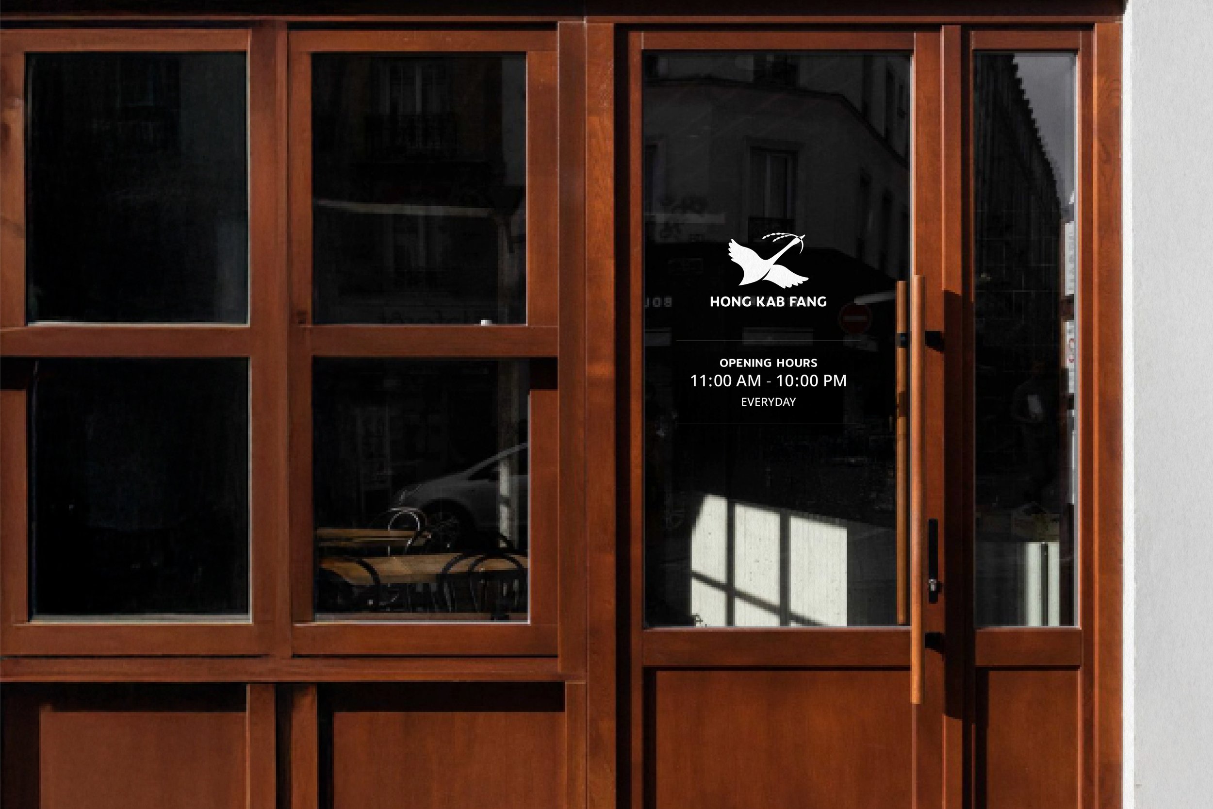
Brand Identity:
Designed to convey a sense of energy, speed, warmth, and approachability for the restaurant.
-Logo: Developed from the brand's existing logo but adjusted to create a friendlier, more approachable, and modern look while retaining the Thai-Chinese essence.
-Color Palette: Evolved from the brand's original orange tones, now made more vibrant to align with the quick-service & self-service restaurant vibe. Paired with warm tones for a visually comfortable yet strong appearance, ensuring versatility across various applications.
Brand Tagline:
Crafted to reflect the brand's focus on care, warmth, and the sense of togetherness in family activities. The tagline is: "Family Comfort in Every Rice Bowl"


ABOUT
Industry: Food & Restaurant
Solutions: Logotype, Color Palette, Font Pairing , Business card, Menu book, Brochure
Style: Joyful | Friendly | Warm-Hearted | Modern but rooted in tradition
DESIGN CONCEPT
Modern Nostalgia: Mimic traditional Asian design but with a more lively twist.
Brand Identity: ออกแบบ identity เพื่อนำเสนอร้านอาหารเวียดนามที่ยังคงความ traditional แต่มีความสดใหม่ สนุกสนานและเข้าถึงได้ง่าย
- Logotype เลือกแบบตัวอักษรที่นำเสนอกลิ่นอายความเป็น traditional มี movement ของเส้น และความหนาของตัวอักษรให้ความหนักแน่น ดึงดูดสายตา
- Color Palette เลือกใช้ชุดสีแดง เขียวกากี และครีม สีแดงสดช่วยดึงความสดใส ความรวดเร็ว สดใหม่ ให้กับร้านอาหารเวียดนาม ในขณะที่สีเขียวและครีม ชูความ traditional ที่ผสมผสานได้อย่างลงตัวกับสีแดงสด
- Layout design ออกแบบ layout ให้อ่านง่ายสบายตา ด้วย column grid ที่ไม่ซับซ้อน ใช้ร่วมกับ graphic element กรอบ รูปแบบต่างๆ ที่เพิ่มความ vintage และความสนุกสนาน
Printing design: ออกแบบเมนู โบชัวร์ และนามบัตร โดยอิงตาม brand identity ที่กำหนดไว้ ใช้ Layout ที่อ่านง่าย สบายตา ในขณะเดียวกับก็เพิ่มความสนุกสนานด้วยชุดสีแดงสดและ graphic element กรอบ โดยทั้งหมดยังคงยึดตาม concept และ keywords ที่กำหนดไว้
ในส่วนของเมนูและโบชัวร์ ที่มีเนื้อหาค่อนข้างเยอะ เราใช้การจัดรวาง layout ด้วย column grid ช่วยในการแบ่งเนื้อหาให้อ่านง่าย และลงตัวในพื้นที่จำกัด
More Projects


Rafiico Design Solution
Rafiico Design Solution มีประสบการณ์ในการออกแบบแบรนด์และแพ็คเกจที่ได้รับการยอมรับจากลูกค้าในหลายธุรกิจ ความคิดสร้างสรรค์, ความเชี่ยวชาญ, และความตั้งใจในการทำงาน ตลอดจนความใส่ใจในดูแลและประสานงานกับลูกค้าทุกท่านเพื่อให้ผลงานออกแบบ ตอบโจทย์ตรงตามความต้องการของลูกค้ามากที่สุด